Table of Contents
An affiliate landing page is a crucial element of your recruitment process. It’s where you’ll direct potential affiliates and present them with your offer to partner with your brand.
With so many programs available for affiliate marketing publishers, it's important to make yours stand out from the competition. Having an effective landing page is key to making a great first impression.
In this article, we’ll explain 8 welcoming components of an affiliate landing page and provide tips on how to include each of them in your own recruitment content.
The Purpose of an Affiliate Program Landing Page
An affiliate landing page is designed to attract prospective publishers and influencers who are a good fit for your affiliate program. With a strict singularity of purpose, a landing page moves your audience to action.
In your case, you want to encourage visitors to apply to your program and promote your products or services.

Landing pages are effective because they remove distractions and present a clear, concise call to action (CTA) that resonates with those you’re trying to reach. This content should be directed at your target audience and convey distinctly outlined benefits.
8 Components of an Actionable Affiliate Landing Page
Below, we've elaborated on 8 elements that help make a successful affiliate landing page. Each plays an important part in moving potential affiliates toward signing up for your program.
1. Attention-Grabbing Headlines
The job of a headline is to capture the attention of page visitors in just a few seconds. An effective headline uses action words and draws an emotional response from the reader, giving them a strong reason to keep reading or take action.

Try writing headlines around the various benefits of your program and the desires of your audience. You can then use A/B testing to identify the most effective one.
2. A List of Affiliate Benefits
Your landing page should list some benefits of your program to motivate your affiliates. In order for this to be effective, you'll need to know your audience, including what they desire and why so you can speak to their drives.
To support your headline, clearly state the value of your program. You can include these points in an easy-to-read list. Use clear, concise language. It’s okay to make bold claims, as long as you can back them up.
Show evidence of your ability to deliver on your promises, such as statistics regarding affiliate sales or commissions.
3. A Clear CTA that Moves People to Respond
A CTA is a simple, clear, and compelling line of text that asks your audience to take a desired action. It should be easily identifiable. You can use design elements such as buttons, colors, and white space to draw your audience to your CTA.
You can stick to basic language that is specific to your next step, such as “click here” or “subscribe”. But it's also a good idea to get creative with your CTA messaging and use phrases that resonate with your reader on a more personal, conversational-type level.

4. Copy that Draws the Reader In
Landing pages should be tightly written and without fluff. Be economical with your words. If they don’t move the reader toward signing up for your affiliate program, eliminate them.
As readers move down the page, every word should work to convince them of your business' value. Use storytelling to take your readers by the hand and guide them.
Engage visitors by explaining how your program works, who your ideal affiliate is, and how they can succeed by partnering with you.
5. Supporting Media that Demonstrates Your Program's Value
Visual elements can sometimes be more effective than text. Take advantage of this by using contemporary images that demonstrate your offer or benefits.
When designing your page, keep in mind that less is more when it comes to graphics on a landing page. Make sure everything visually drives the visitor to your main offer and CTA. Be careful not to distract your audience with too many or misplaced visuals.

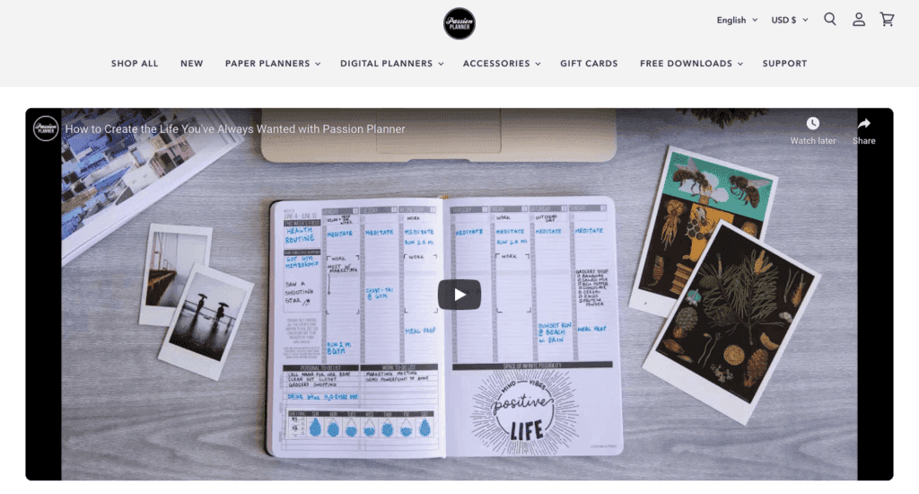
You can also use video to share the success stories of other affiliates (especially in their own words) or as an explainer of your program. Keep this content short and try to proactively answer questions viewers may have.
6. Clean Page Design that Doesn’t Get in the Way
A landing page has a single, simple purpose. It may be tempting to include tons of graphics and information to keep your audience on the page. However, it's usually best to go with a simple and focused design to convert more high-quality leads.
Remember, you're looking for the ideal affiliate. Remove everything that distracts from that purpose – be it text, design elements, or navigation links that redirect visitors away from your CTA.
If you're not sure how to design your landing page, it can be helpful to start with a template designed by a page builder plugin.
7. Endorsements that Build Trust
People place value in testimonials, reviews, and endorsements. They’re more likely to trust their peers than unfamiliar businesses. You can build trust and give people the confidence to take the next step by including testimonials to address potential objections.
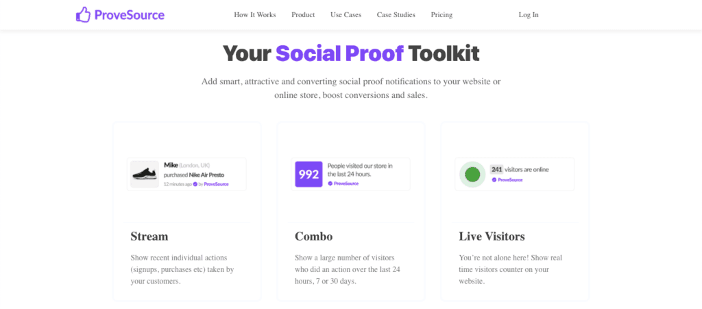
Include social proof to demonstrate how others have taken action and benefitted from your affiliate program. There are several social proof tools such as ProveSource to help you incorporate this persuasive element into your landing page:

When your landing page visitors see that other people are signing up, they’ll be more likely to want to follow suit.
8. A Guarantee that Minimizes Risk
Although many affiliates seek partnerships with brands they already know and use, there's a strong chance they may still have apprehensions about working with your business. There's a big difference between buying a product and aligning yourself with a brand, especially when your income depends on it.
To earn leads' trust, clearly state that you will minimize the risks involved, leaving them free to earn the rewards. In this partnership, you’ll provide them with valuable resources and promotional tools, and they’ll earn commissions, discounts, or other payouts.
Highlight any training materials or other resources that can help affiliates get started quickly and easily. The idea here is to show them they have nothing to lose by taking action. You’re freely providing support to help them earn commissions promoting your products and services.
Conclusion
An affiliate landing page serves as an introduction to your affiliate program for new recruits. You have an incredible opportunity to craft your first impression as a valued partner.
In this article, we discussed eight key components of a conversion-driving affiliate landing page. It should include an attention-grabbing headline, strategic copy and media that support your value proposition, and a clear and strong CTA.
Do you have questions about affiliate landing pages? Let us know in the comments section below!
If you liked this article, follow us on Twitter, Facebook, and LinkedIn. And don't forget to subscribe to our newsletter!


Leave a Reply